Insurance Website Redesign
Bringing the new AmeriLife branding to shine on the web
Client
AmeriLife
Services
Visual Design
UI & UX Design
Industries
Insurance (B2C)
Date
Continuous

Project Overview
Amerilife had an informational website that was working like an informational brochure, but the company was growing every year more and more, so they created more materials about its services, opportunities for carriers and agents, locations, company structure. They paid a lot of attention to growth and minimal attention to scaling the website.
Design Challenge
The goal from the brief is to create a refreshed website (brochure site) that underscores Amerilife’s revised brand positioning and brings new light on the company vision, mission, and set of core values.
The brand rolled out its new “Together as ONE” brand positioning to reinforce its culture and commitment. Tone: Serious, Direct, Sincere, Approachable but Assertive.
Challenges:
We had six weeks for audit, redesign with very vague requirements, which were changed two times per week;
First 4 weeks, we were working without content, trying to guess what the client wanted;
Show brand identity in new visual design;
Fix the current website UX Structure which was unnecessarily overcomplicated.

Process
We created a roadmap with six stages (one week each) to plan our work. We were working by Kanban methodology because we didn’t understand all requirements and the full scope of work.

To understand the types of content and general scope of information, we created a Sitemap of the current website.
Unfortunately, we have found some repeated mistakes:
Too much-nested content;
Broken hierarchy in links;
A lot of hidden pages without a clear hierarchy in the blog;
We created a new sitemap with a clear structure and easy access to the content for users.
To get feedback from the client, we created wireframes. We didn’t have the full scope of content, but time was going, that’s why we created the first wireframes based on our assumptions using content from different sources: current website and brief.

To understand the market and opportunities for differentiating from competitors, we conducted a competitor analysis.


According to the brand book, we used a green and blue gradient on images, icons, and backgrounds to express brand identity. In addition, to reinforce Amerilife’s culture, we showed new positioning, “Together as ONE” via text and pictures.
To show brand mood as serious, direct, sincere, and assertive, we used a clean design with a lot of white space and strong accents on key messages.

In such a way, we created some visual design options for the Home page. Then, after some iterations with the client’s feedback, we moved forward with the design concept.
To structure articles and press releases in the blog, we added a colorful label and grouped them for easy navigation.

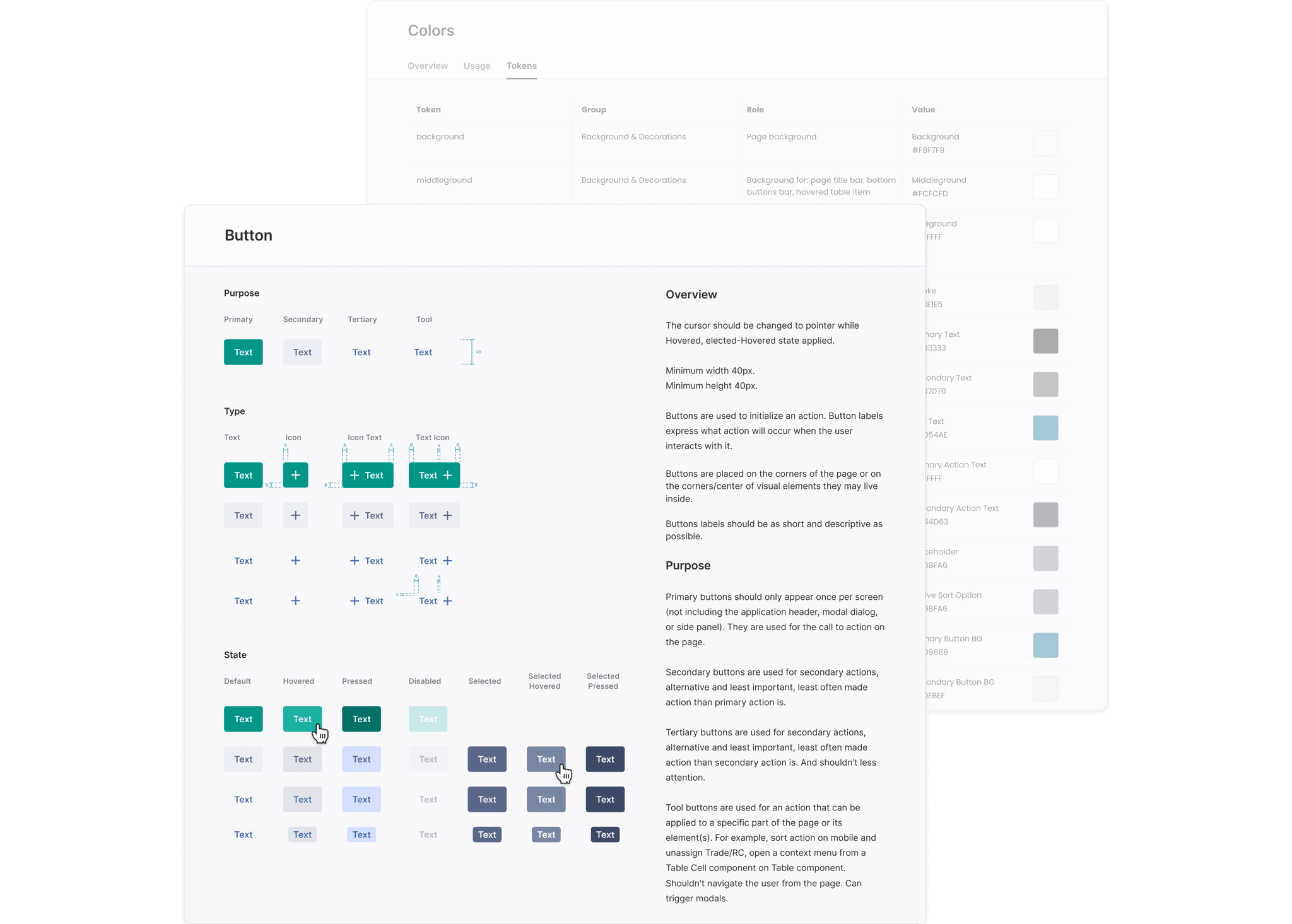
To unify the design and make it consistent, we created a UI kit with elements used on different pages.


To cut time on designing pages that didn’t have content for that moment, we, together with the client, decided to create templates of blocks that could be reused on the following pages and consider all possible options of content types and the number of elements.

Summary Outcome
The client was satisfied with the final design and new website build. Provided UI kit (Design System) would help new AmeriLife website scale quickly while keeping all pages design consistent.
The client’s team sent excellent feedback seeing well-organized teamwork within strict deadlines and with unclear requirements to deliver a website redesign that reflects the new AmerLife brand and fits the need of each audience. They appreciated easy communication and high-quality design even when requirements were changing twice per week.
As a result of such collaboration Ameriife signed contract with EPAM to work on bigger project, because they saw professional approach and high-quality delivery.
Mockups
Through extensive user research, we discovered that many e-bike users felt overwhelmed by the technology and controls on their bikes. To address this, we created a simple and intuitive interface that allows riders to easily adjust their level of assist and monitor their battery life. We also incorporated GPS navigation, allowing riders to plan their route and track their progress.
Through extensive user research, we discovered that many e-bike users felt overwhelmed by the technology and controls on their bikes. To address this, we created a simple and intuitive interface that allows riders to easily adjust their level of assist and monitor their battery life. We also incorporated GPS navigation, allowing riders to plan their route and track their progress.
Insurance Website Redesign
Bringing the new AmeriLife branding to shine on the web
Client
AmeriLife
Services
Visual Design
UI & UX Design
Industries
Insurance (B2C)
Date
Continuous

Project Overview
Project Overview
Amerilife had an informational website that was working like an informational brochure, but the company was growing every year more and more, so they created more materials about its services, opportunities for carriers and agents, locations, company structure. They paid a lot of attention to growth and minimal attention to scaling the website.
Amerilife had an informational website that was working like an informational brochure, but the company was growing every year more and more, so they created more materials about its services, opportunities for carriers and agents, locations, company structure. They paid a lot of attention to growth and minimal attention to scaling the website.
Design Challenge
Design Challenge
The goal from the brief is to create a refreshed website (brochure site) that underscores Amerilife’s revised brand positioning and brings new light on the company vision, mission, and set of core values.
The goal from the brief is to create a refreshed website (brochure site) that underscores Amerilife’s revised brand positioning and brings new light on the company vision, mission, and set of core values.
The brand rolled out its new “Together as ONE” brand positioning to reinforce its culture and commitment. Tone: Serious, Direct, Sincere, Approachable but Assertive.
The brand rolled out its new “Together as ONE” brand positioning to reinforce its culture and commitment. Tone: Serious, Direct, Sincere, Approachable but Assertive.
Challenges:
Challenges:
We had six weeks for audit, redesign with very vague requirements, which were changed two times per week;
First 4 weeks, we were working without content, trying to guess what the client wanted;
Show brand identity in new visual design;
Fix the current website UX Structure which was unnecessarily overcomplicated.

Process
Process
We created a roadmap with six stages (one week each) to plan our work. We were working by Kanban methodology because we didn’t understand all requirements and the full scope of work.
We created a roadmap with six stages (one week each) to plan our work. We were working by Kanban methodology because we didn’t understand all requirements and the full scope of work.


To understand the types of content and general scope of information, we created a Sitemap of the current website.
To understand the types of content and general scope of information, we created a Sitemap of the current website.
Unfortunately, we have found some repeated mistakes:
Unfortunately, we have found some repeated mistakes:
Too much-nested content;
Broken hierarchy in links;
A lot of hidden pages without a clear hierarchy in the blog;
We created a new sitemap with a clear structure and easy access to the content for users.
To get feedback from the client, we created wireframes. We didn’t have the full scope of content, but time was going, that’s why we created the first wireframes based on our assumptions using content from different sources: current website and brief.
To get feedback from the client, we created wireframes. We didn’t have the full scope of content, but time was going, that’s why we created the first wireframes based on our assumptions using content from different sources: current website and brief.

To understand the market and opportunities for differentiating from competitors, we conducted a competitor analysis.
To understand the market and opportunities for differentiating from competitors, we conducted a competitor analysis.


According to the brand book, we used a green and blue gradient on images, icons, and backgrounds to express brand identity. In addition, to reinforce Amerilife’s culture, we showed new positioning, “Together as ONE” via text and pictures.
According to the brand book, we used a green and blue gradient on images, icons, and backgrounds to express brand identity. In addition, to reinforce Amerilife’s culture, we showed new positioning, “Together as ONE” via text and pictures.
To show brand mood as serious, direct, sincere, and assertive, we used a clean design with a lot of white space and strong accents on key messages.
To show brand mood as serious, direct, sincere, and assertive, we used a clean design with a lot of white space and strong accents on key messages.

In such a way, we created some visual design options for the Home page. Then, after some iterations with the client’s feedback, we moved forward with the design concept.
In such a way, we created some visual design options for the Home page. Then, after some iterations with the client’s feedback, we moved forward with the design concept.
To structure articles and press releases in the blog, we added a colorful label and grouped them for easy navigation.
To structure articles and press releases in the blog, we added a colorful label and grouped them for easy navigation.

To unify the design and make it consistent, we created a UI kit with elements used on different pages.
To unify the design and make it consistent, we created a UI kit with elements used on different pages.
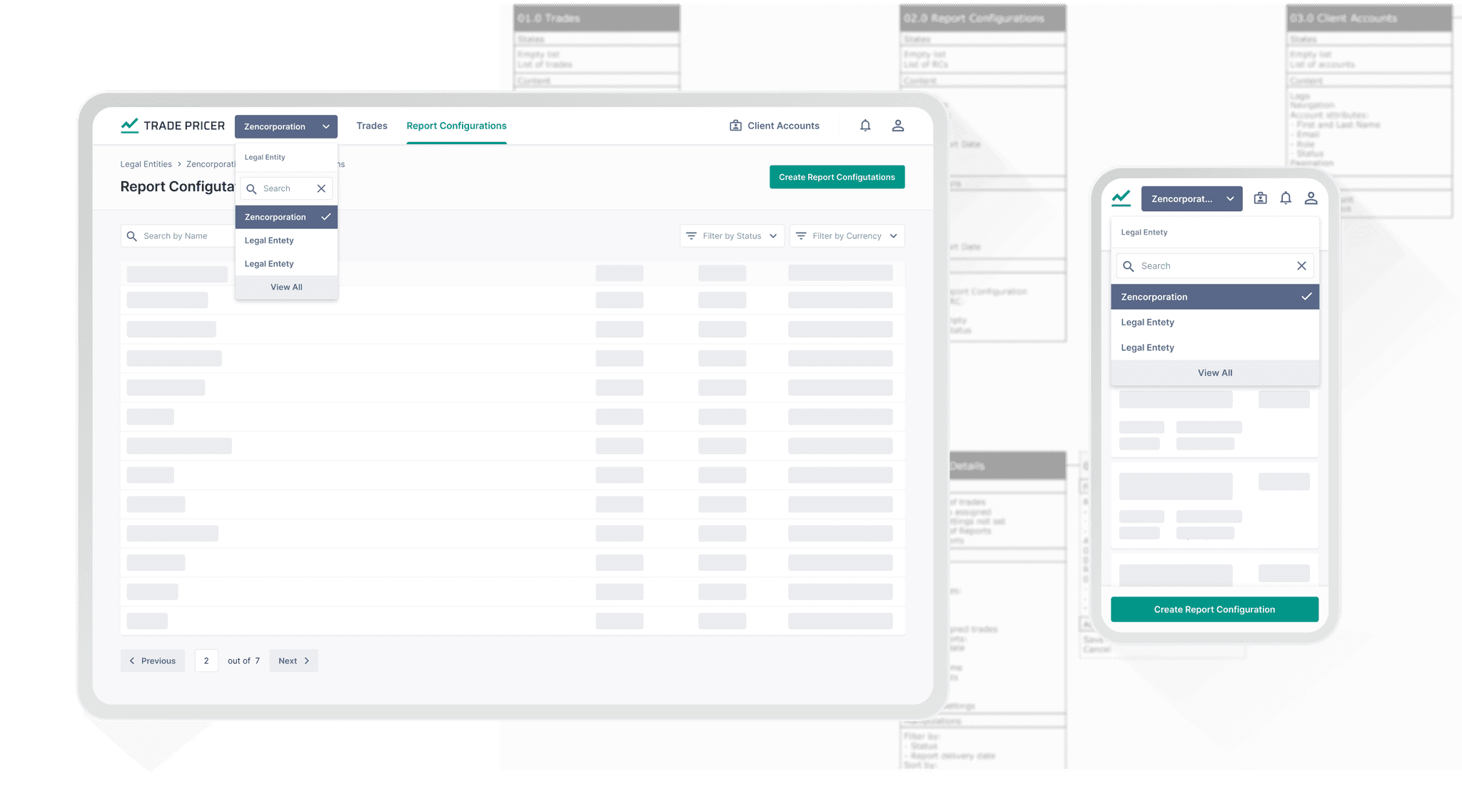


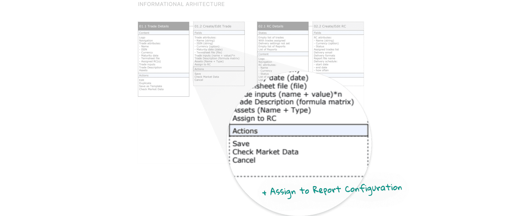
To cut time on designing pages that didn’t have content for that moment, we, together with the client, decided to create templates of blocks that could be reused on the following pages and consider all possible options of content types and the number of elements.
To cut time on designing pages that didn’t have content for that moment, we, together with the client, decided to create templates of blocks that could be reused on the following pages and consider all possible options of content types and the number of elements.


Summary Outcome
Summary Outcome
The client was satisfied with the final design and new website build. Provided UI kit (Design System) would help new AmeriLife website scale quickly while keeping all pages design consistent.
The client was satisfied with the final design and new website build. Provided UI kit (Design System) would help new AmeriLife website scale quickly while keeping all pages design consistent.
The client’s team sent excellent feedback seeing well-organized teamwork within strict deadlines and with unclear requirements to deliver a website redesign that reflects the new AmerLife brand and fits the need of each audience. They appreciated easy communication and high-quality design even when requirements were changing twice per week.
The client’s team sent excellent feedback seeing well-organized teamwork within strict deadlines and with unclear requirements to deliver a website redesign that reflects the new AmerLife brand and fits the need of each audience. They appreciated easy communication and high-quality design even when requirements were changing twice per week.
As a result of such collaboration Ameriife signed contract with EPAM to work on bigger project, because they saw professional approach and high-quality delivery.
As a result of such collaboration Ameriife signed contract with EPAM to work on bigger project, because they saw professional approach and high-quality delivery.
Mockups
Mockups
Through extensive user research, we discovered that many e-bike users felt overwhelmed by the technology and controls on their bikes. To address this, we created a simple and intuitive interface that allows riders to easily adjust their level of assist and monitor their battery life. We also incorporated GPS navigation, allowing riders to plan their route and track their progress.
Through extensive user research, we discovered that many e-bike users felt overwhelmed by the technology and controls on their bikes. To address this, we created a simple and intuitive interface that allows riders to easily adjust their level of assist and monitor their battery life. We also incorporated GPS navigation, allowing riders to plan their route and track their progress.
Insurance Website Redesign
Bringing the new AmeriLife branding to shine on the web
Client
AmeriLife
Services
Visual Design
UI & UX Design
Industries
Insurance (B2C)
Date
Continuous


Project Overview
Project Overview
Amerilife had an informational website that was working like an informational brochure, but the company was growing every year more and more, so they created more materials about its services, opportunities for carriers and agents, locations, company structure. They paid a lot of attention to growth and minimal attention to scaling the website.
Amerilife had an informational website that was working like an informational brochure, but the company was growing every year more and more, so they created more materials about its services, opportunities for carriers and agents, locations, company structure. They paid a lot of attention to growth and minimal attention to scaling the website.
Design Challenge
Design Challenge
The goal from the brief is to create a refreshed website (brochure site) that underscores Amerilife’s revised brand positioning and brings new light on the company vision, mission, and set of core values.
The goal from the brief is to create a refreshed website (brochure site) that underscores Amerilife’s revised brand positioning and brings new light on the company vision, mission, and set of core values.
The brand rolled out its new “Together as ONE” brand positioning to reinforce its culture and commitment. Tone: Serious, Direct, Sincere, Approachable but Assertive.
The brand rolled out its new “Together as ONE” brand positioning to reinforce its culture and commitment. Tone: Serious, Direct, Sincere, Approachable but Assertive.
Challenges:
Challenges:
We had six weeks for audit, redesign with very vague requirements, which were changed two times per week;
First 4 weeks, we were working without content, trying to guess what the client wanted;
Show brand identity in new visual design;
Fix the current website UX Structure which was unnecessarily overcomplicated.


Process
Process
We created a roadmap with six stages (one week each) to plan our work. We were working by Kanban methodology because we didn’t understand all requirements and the full scope of work.
We created a roadmap with six stages (one week each) to plan our work. We were working by Kanban methodology because we didn’t understand all requirements and the full scope of work.


To understand the types of content and general scope of information, we created a Sitemap of the current website.
To understand the types of content and general scope of information, we created a Sitemap of the current website.
Unfortunately, we have found some repeated mistakes:
Unfortunately, we have found some repeated mistakes:
Too much-nested content;
Broken hierarchy in links;
A lot of hidden pages without a clear hierarchy in the blog;
We created a new sitemap with a clear structure and easy access to the content for users.
To get feedback from the client, we created wireframes. We didn’t have the full scope of content, but time was going, that’s why we created the first wireframes based on our assumptions using content from different sources: current website and brief.
To get feedback from the client, we created wireframes. We didn’t have the full scope of content, but time was going, that’s why we created the first wireframes based on our assumptions using content from different sources: current website and brief.


To understand the market and opportunities for differentiating from competitors, we conducted a competitor analysis.
To understand the market and opportunities for differentiating from competitors, we conducted a competitor analysis.


According to the brand book, we used a green and blue gradient on images, icons, and backgrounds to express brand identity. In addition, to reinforce Amerilife’s culture, we showed new positioning, “Together as ONE” via text and pictures.
According to the brand book, we used a green and blue gradient on images, icons, and backgrounds to express brand identity. In addition, to reinforce Amerilife’s culture, we showed new positioning, “Together as ONE” via text and pictures.
To show brand mood as serious, direct, sincere, and assertive, we used a clean design with a lot of white space and strong accents on key messages.
To show brand mood as serious, direct, sincere, and assertive, we used a clean design with a lot of white space and strong accents on key messages.


In such a way, we created some visual design options for the Home page. Then, after some iterations with the client’s feedback, we moved forward with the design concept.
In such a way, we created some visual design options for the Home page. Then, after some iterations with the client’s feedback, we moved forward with the design concept.
To structure articles and press releases in the blog, we added a colorful label and grouped them for easy navigation.
To structure articles and press releases in the blog, we added a colorful label and grouped them for easy navigation.


To unify the design and make it consistent, we created a UI kit with elements used on different pages.
To unify the design and make it consistent, we created a UI kit with elements used on different pages.


To cut time on designing pages that didn’t have content for that moment, we, together with the client, decided to create templates of blocks that could be reused on the following pages and consider all possible options of content types and the number of elements.
To cut time on designing pages that didn’t have content for that moment, we, together with the client, decided to create templates of blocks that could be reused on the following pages and consider all possible options of content types and the number of elements.


