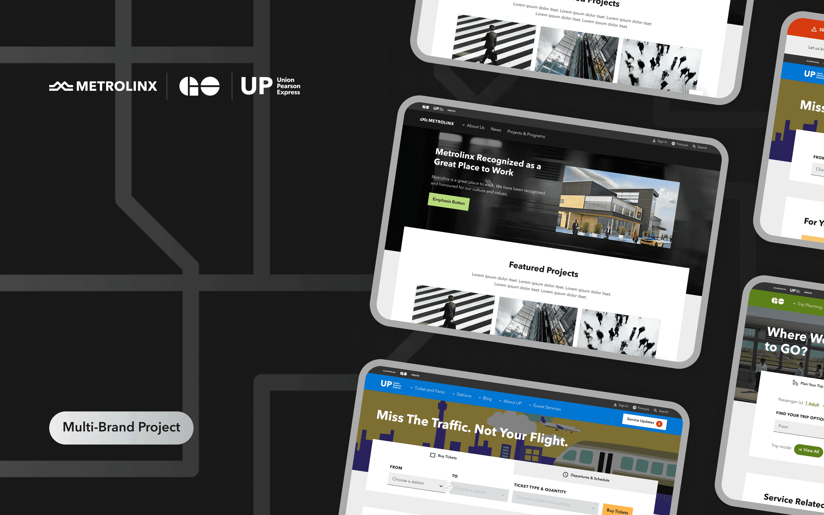
Multi-Brand Transportation Sites
Making public commute in Toronto faster and hustle free
Client
Metrolinx
Services
Visual Design
UI & UX Design
Industries
Transportaion (B2C)
Date
June 2023

Project Overview
As an Experience Designer, I explored and designed multiple-brand solutions for public transportation websites.
About Product
Metrolinx’s multiple public transportation websites help users get information about transportation infrastructure, find a station or stop, plan their trip and buy tickets.
About Client
Metrolinx is a Canadian government transportation agency that operates in Ontario and owns multiple public transportation brands.
Metrolinx was trying to update three public transportation websites of brands they own (Metrolinx, GO Transit, UP Express) they own, to modern standards.
Problems & Goals
Problem Statement
Audit and update Metrolinx’s website design to modern standards. Maintain use knowledge and improve the usability for the end users, and let all websites stand visually as a part of a global Metrolinx brand while keeping every sub-brands own brand appearance in place.
Project Goal
Design a modern solution for Metrolinx, GO Transit, and UP Express websites to let the end users use those tools clearly and efficiently while understanding them as a part of global Metrolinx brands.
Solution
Interface Design
Mockups of interface design for all pages of updated Metrolinx, GO Transit, and UP Express websites, that cover both mobile and desktop devices in two languages (French and English) and match the global Metrolinx brand.
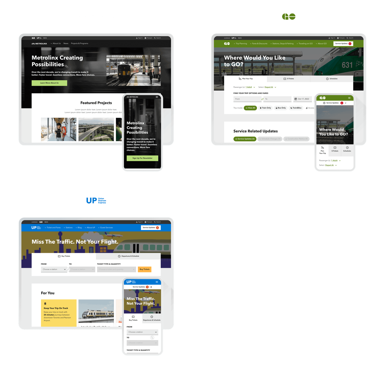
UI solutions follow WCAG 2.0 level AA accessibility requirements.
Interface design solutions are based on the end users’ core needs to buy tickets, plan their trips, and get transportation updates to get in place in time with maximum comfort and minimum effort.
Design System
Mockups of interface design for all pages of updated Metrolinx, GO Transit, and UP Express websites, that cover both mobile and desktop devices in two languages (French and English) and match the global Metrolinx brand.

My Approach
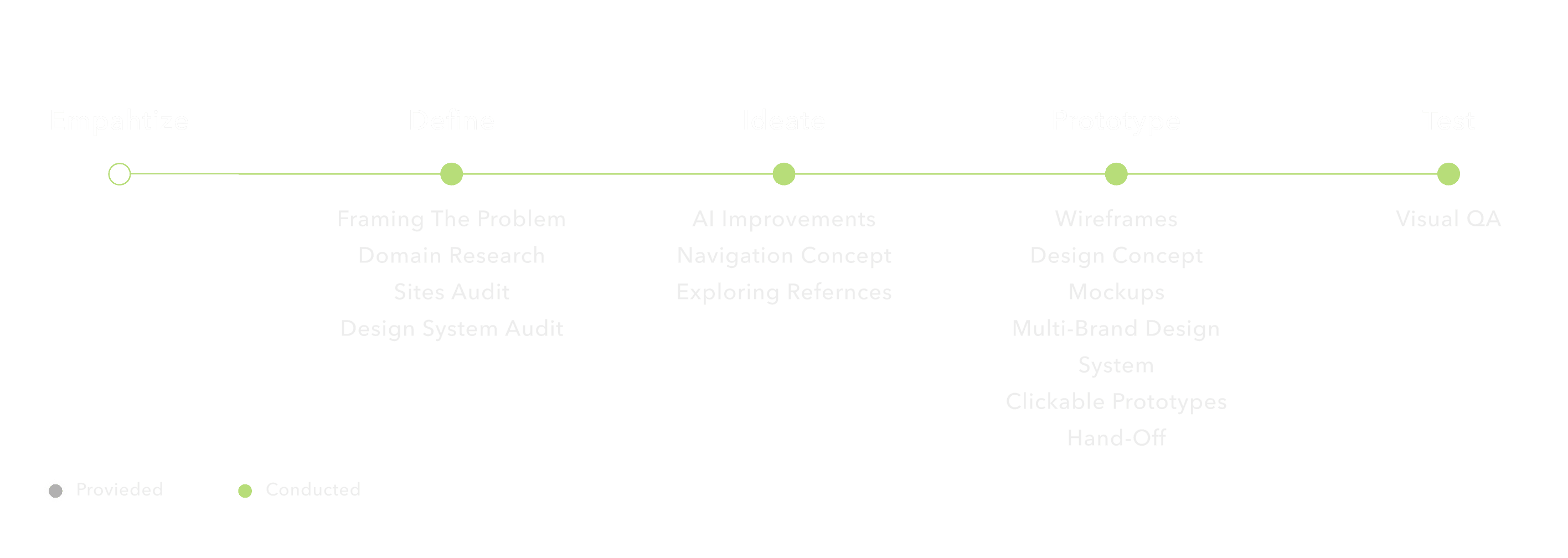
I followed the HCD process. It allowed me to focus on users in each phase of the process to develop a solution that suits users’ needs in the best way.
Key Challenges & Design Decisions
Design Time Optimization
Mockups of interface design for all pages of updated Metrolinx, GO Transit, and UP Express websites, that cover both mobile and desktop devices in two languages (French and English) and match the global Metrolinx brand.
When our Experience Design team finished the work with the first website of Metrolinx – the main Metrolinx site and get started with the next one – the GO Transit website, I conducted the current GO website audit. I wanted to explore what components are used on the website to define those that could be fully reused or partly reused with GO Transit styling, from components that we already designed for Metrolinx and new components that should be built exclusively for GO Trains.
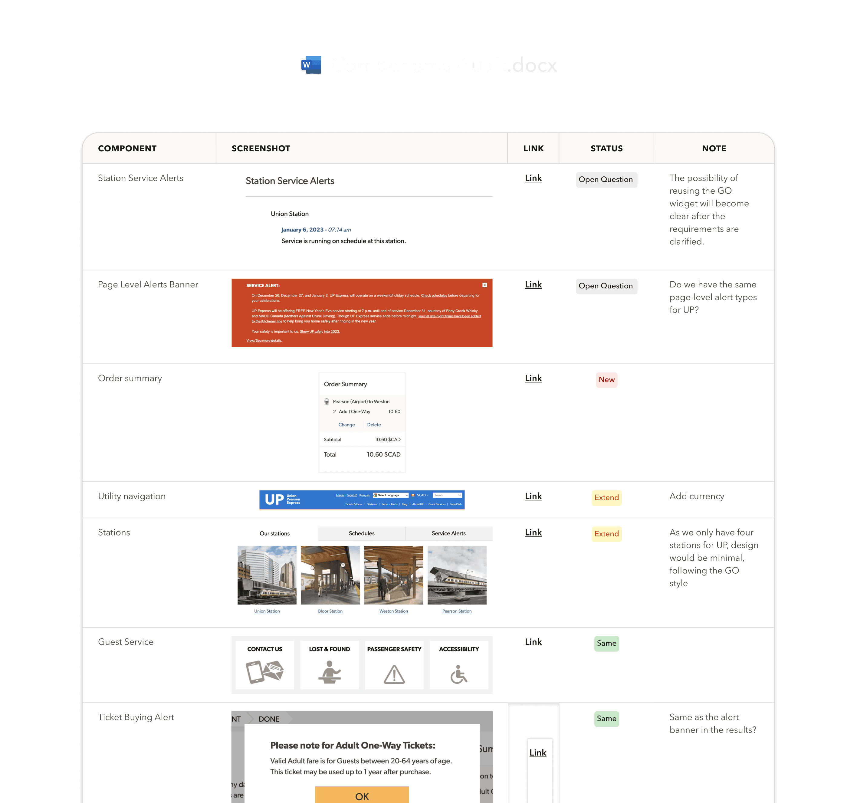
That helped to save development costs and optimize the design time.
Complex Navigation
While working on navigation for GO Transit, I discovered the unnecessary complexity of the existing website structure. So I’ve conducted an analysis of the current GO Transit navigation system site.
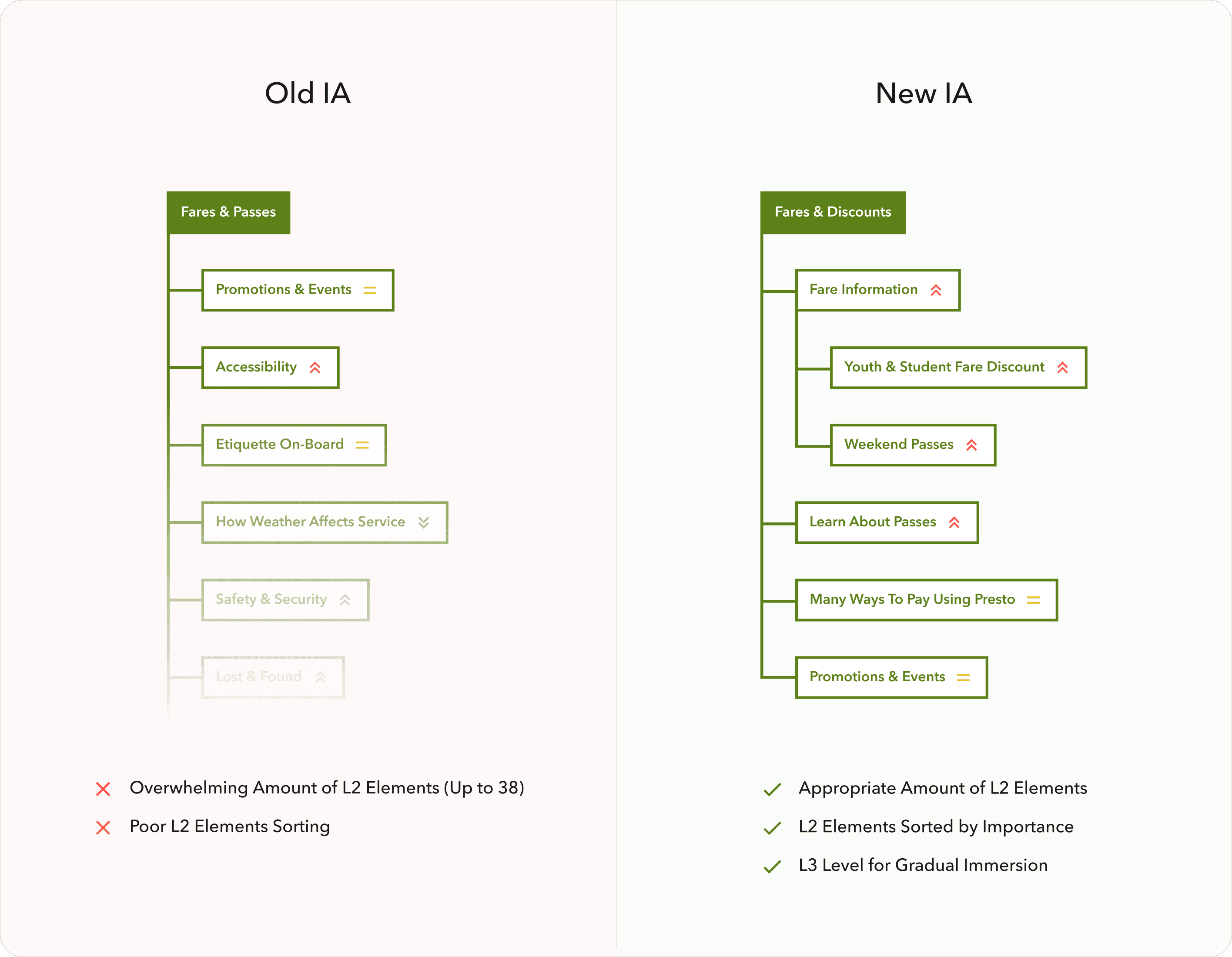
Then I prepared a solution to optimize and simplify the navigation for end users. I’ve achieved minimizing the top-level items from nine to six primary navigation items.
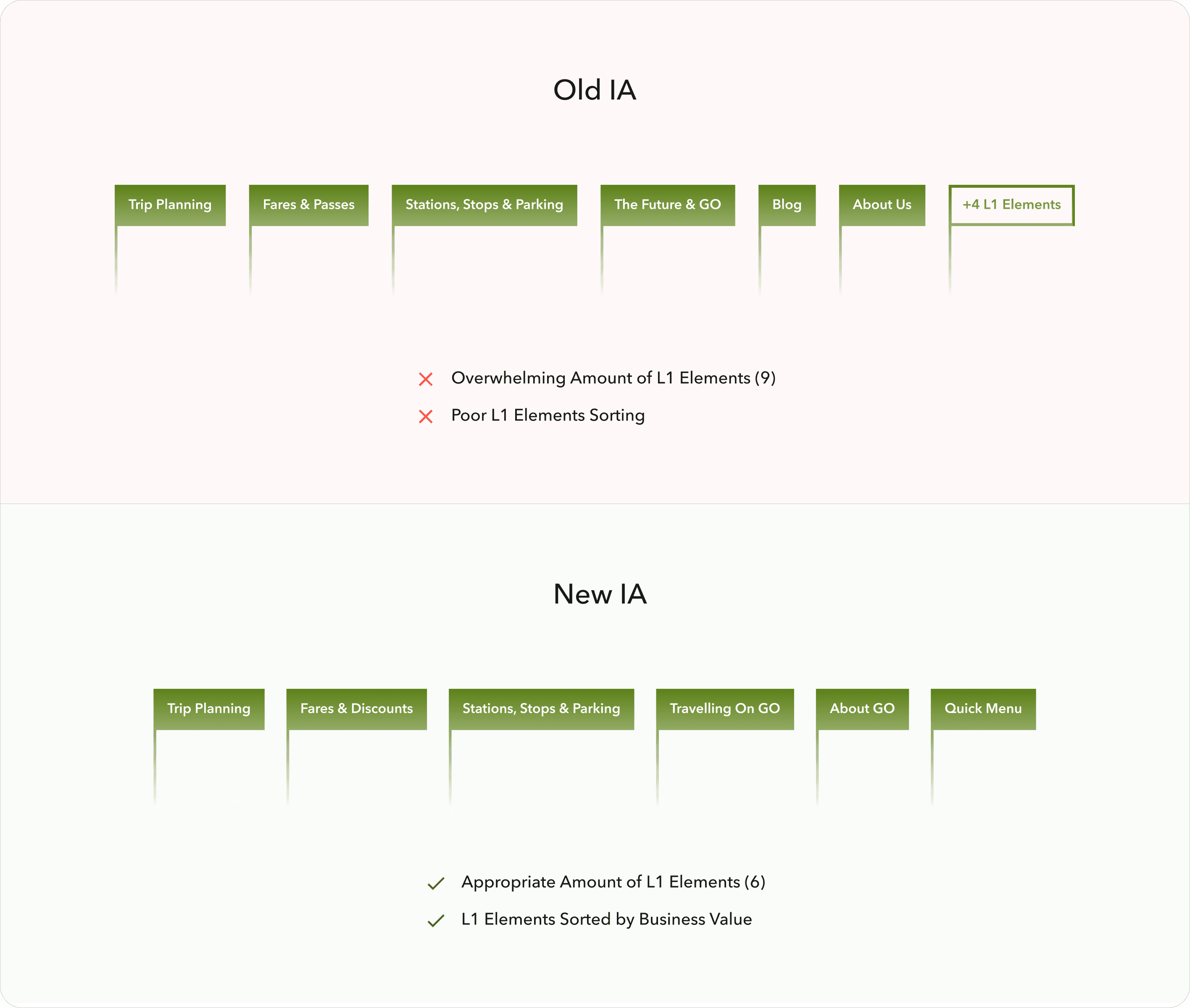
Reorganized the lower-level items into more convenient order and more logical distribution across top-level items.
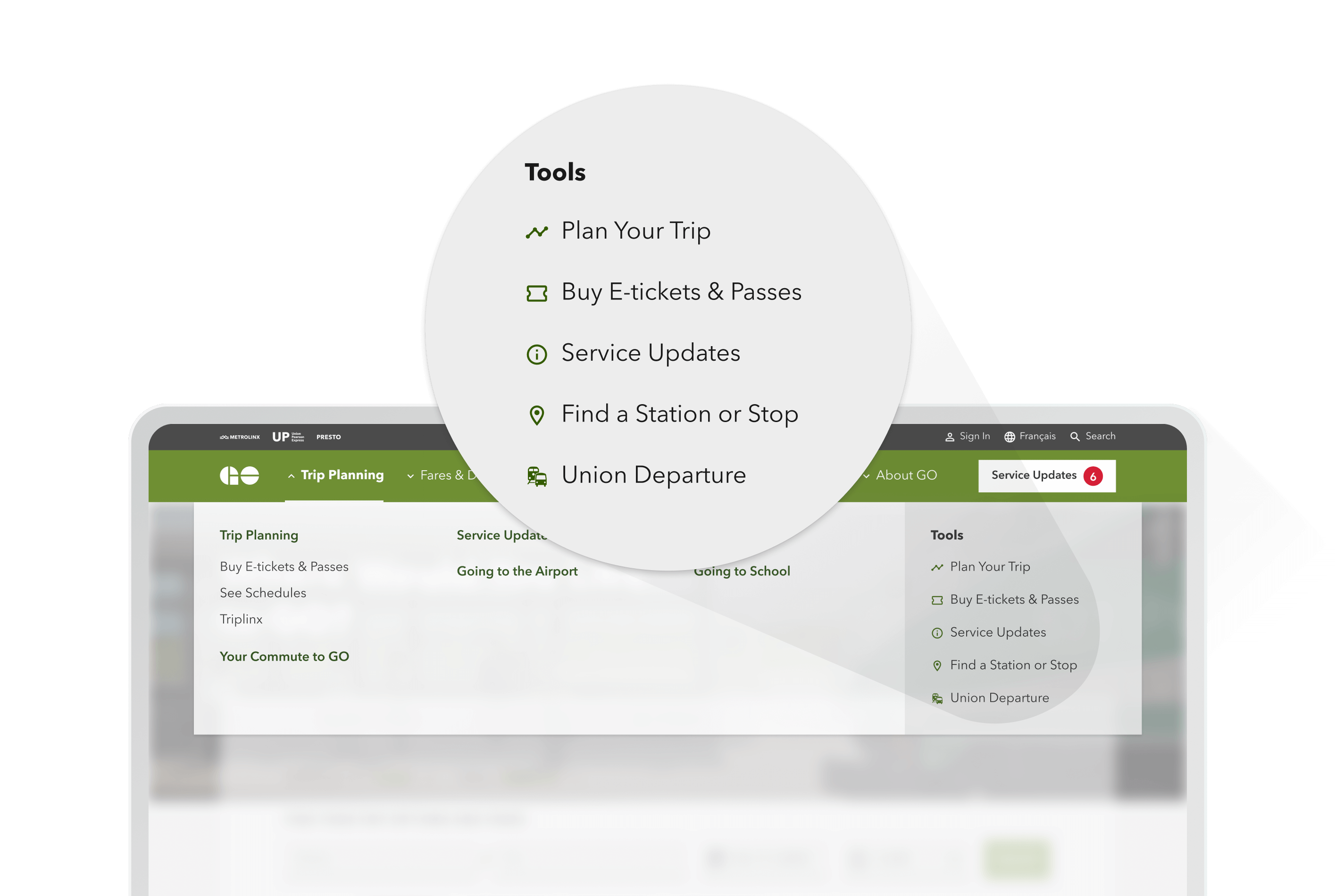
I’ve introduced the Service Update widget that lives in global navigation, as a high business value item, to help users get the most recent updates as easily as possible.
I also kept the balance with the current navigation experience and possible improvements, so old users wouldn’t feel lost using the updated website.
I have worked in tight collaboration with the content strategy time in terms of naming different items and with the usability testing team to validate the final solution with real users.
Global Brand Dedicated Sub-Brands Exposure
One of Metrolinx’s business goals was to visually represent updated resources of Metrolinx, GO Transit, and UP Express as a part of the global Metrolinx brand.
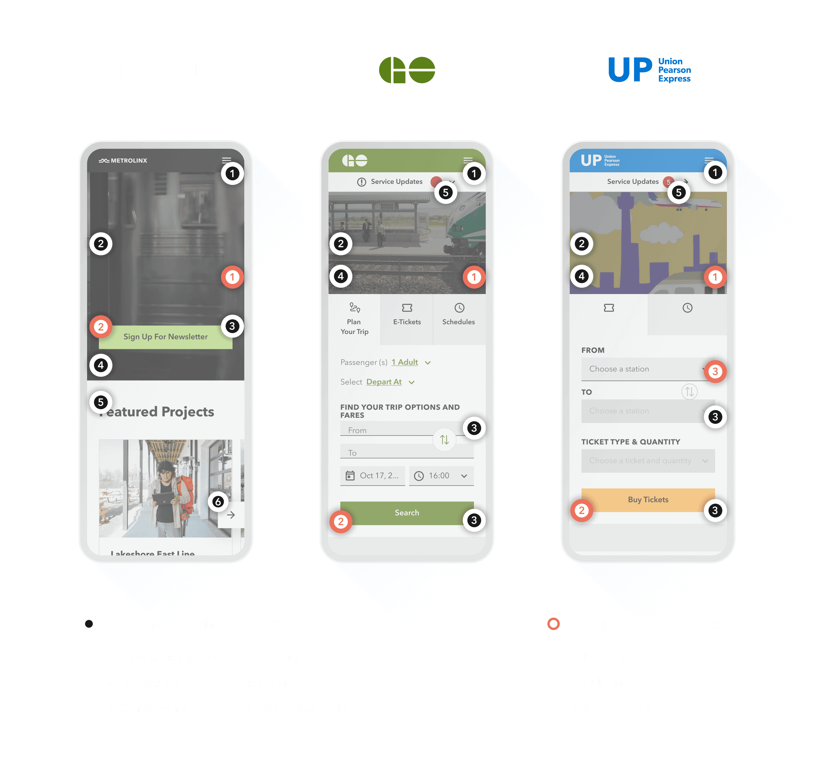
To achieve that goal our Experience Design team defined common visual properties, such as typography, iconography, page layouts, and component styles that should be applied to all updated websites.
To show the difference between Metrolinx sub-brands we applied appropriate brand styling. We used sub-brand colors, illustrations, and shapes to let each sub-brand stand out among others and expose its own personality.
Improving Service Updates Accessibility
Our team discovered and usability issue across GO Transit and UP Express websites on the Service Update page:
Service updates content was poorly structured, especially for cases with multiple updates for one instance (service or station);
High-level service updates categories weren’t clear to understand and navigate to/between them.
Based on my research, I’ve prepared a solution for those two issues:
Established categorization for service update items. Now users can easily distinguish the service update items from one another, without reading the whole description, by category icon and the title, which improved the visual search for the specific affected area updates.
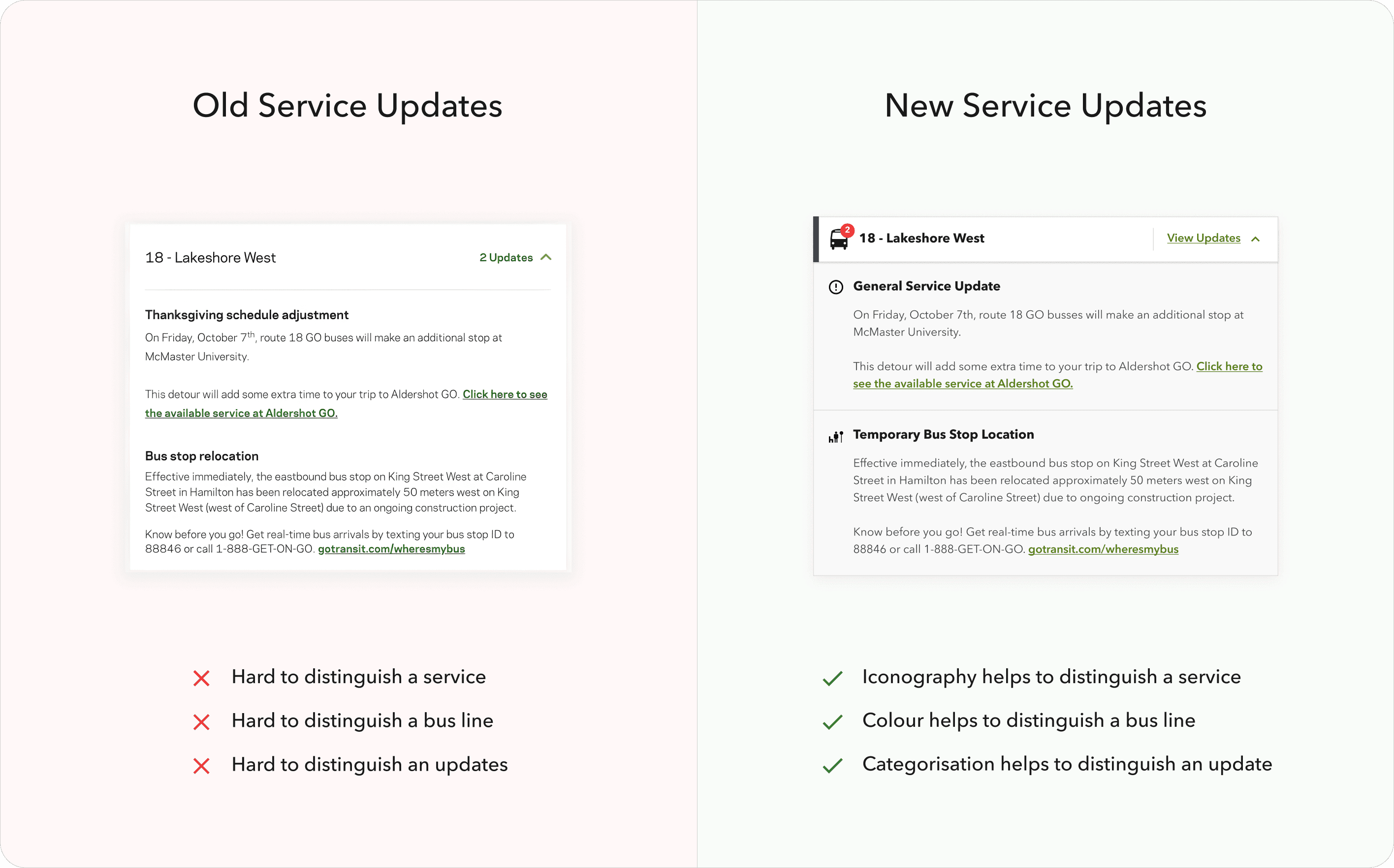
Consolidated Construction Notices, Schedule Changes, and Service Updates under the same logical category, which improved the navigation to/between high-level service update categories and let them be accessible from a single widget on a Service Update page.
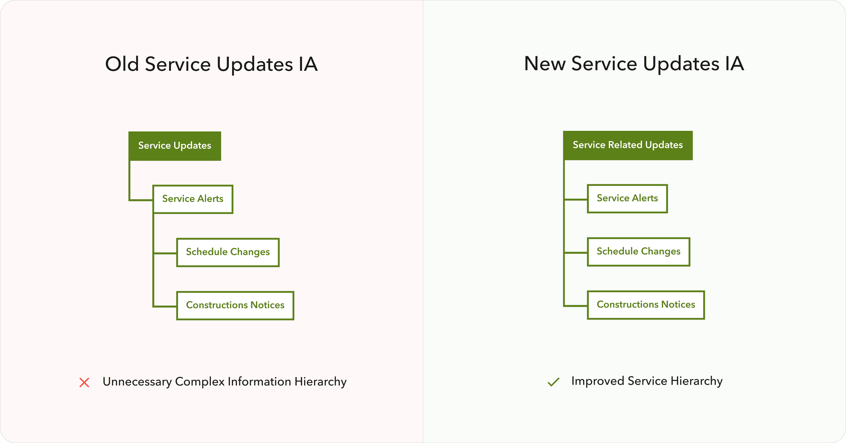
Made service updates from different high-level categories look and behave the same, which improved the consistency and learning curve for the new users.
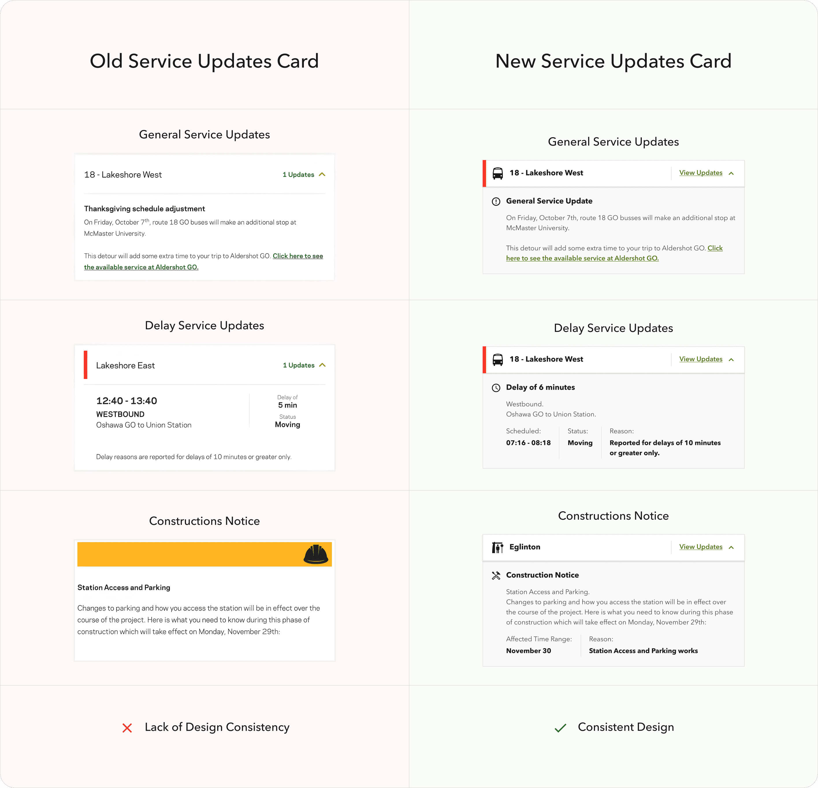
Suggested adding a service updates counter to a service update CTA/widget in the header, to let users be aware if there are any changes for the service updates that might affect their trip.
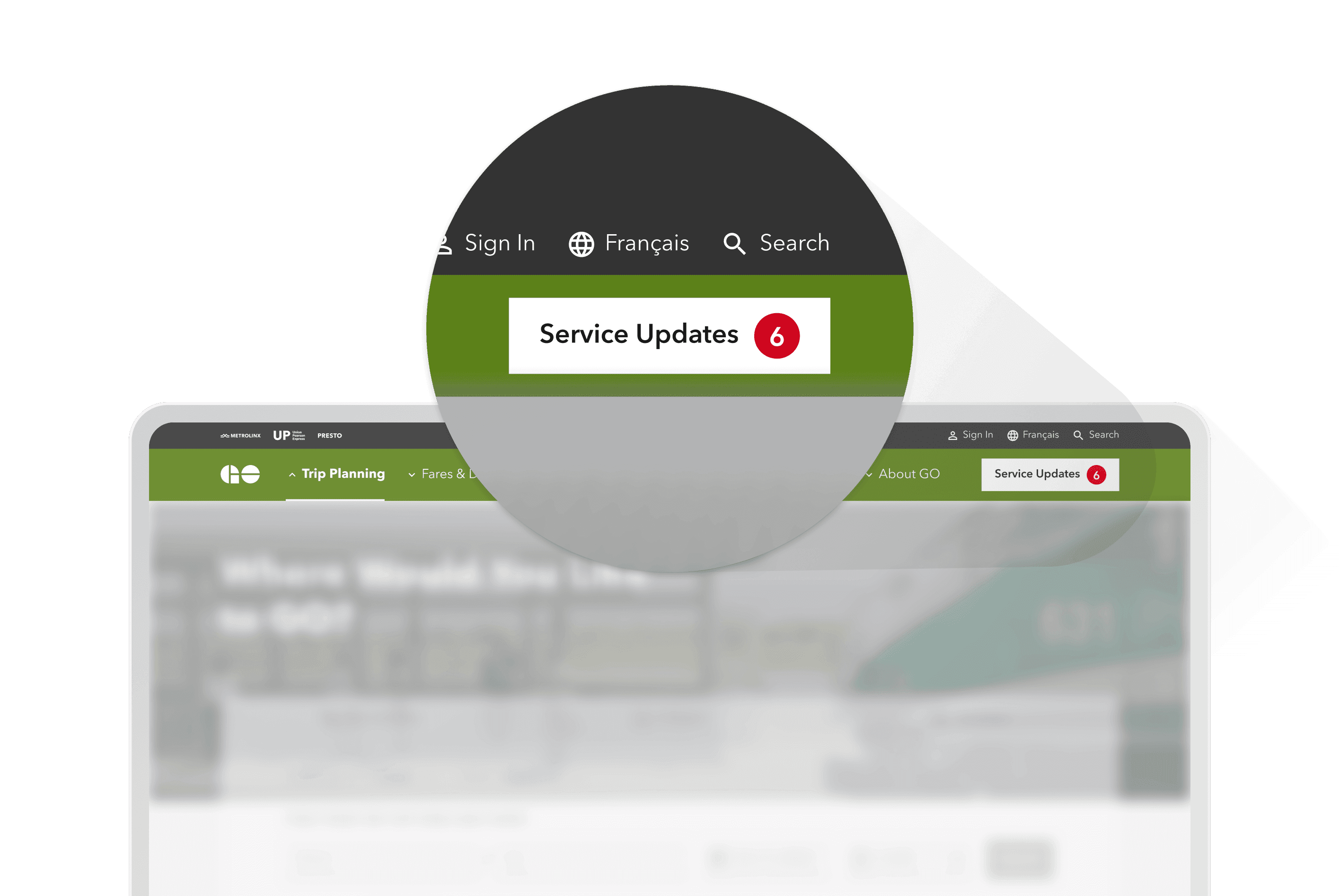
Multi Brand Design System
Since the future Design System should cover all sub-brands of Metrolinx and stay scalable while working with each individual brand, we conducted and workshop session to define how we could achieve it within the framework of the Figma Design System.
We defined that it will be best to establish so-called Base Components, which are brand-neutral components, and brand-specific components, which are brand-styled Base Components used for specific brand websites. And we kept that typography, and iconography as a global style that could be applied to every brand website.
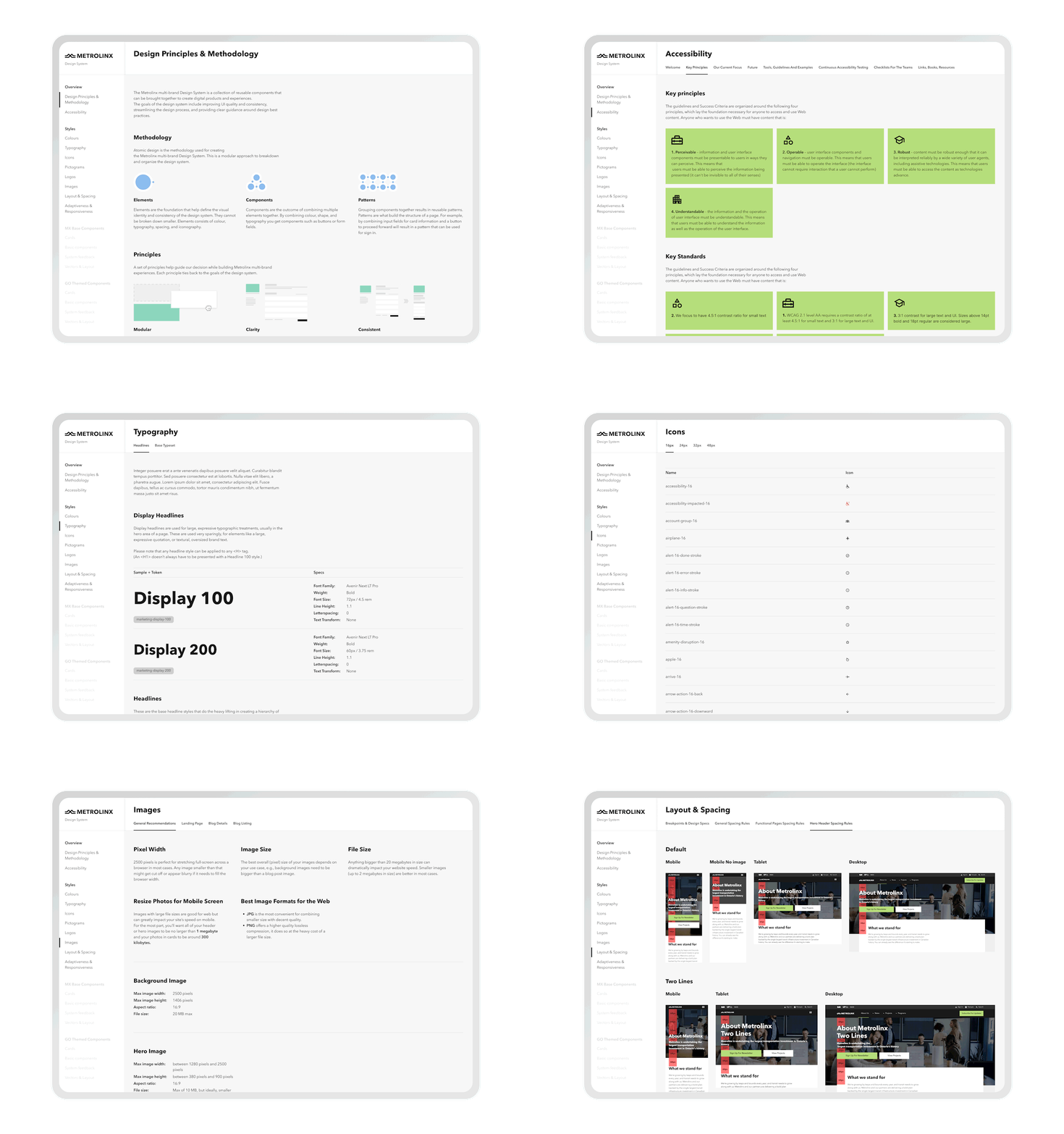
We described every component and its variations, global styles, and rules and included them in the Design System.
I’ve designed and developed an interactive Figma prototype that works as a reference website for the Design System and could be opened in any browser by a link. That way Design System is now accessible through the Figma file and Figma (website-like) prototype so it could be easily used by both development and content strategy teams.
Summary Outcome
The business goal was achieved. Metrolinx got modern and scalable websites as well as flexible, well-described ds, which allowed them to save costs for future digital modernization and support.
Metrolinx’s business increased its brand and sub-brand awareness and loyalty.
Metrolinx passengers can now enjoy the modern digital transportation experience, being an important part of their physical transportation experience with Metrolinx.
Mockups
Multi-Brand Transportation Sites
Making public commute in Toronto faster and hustle free
Client
Metrolinx
Services
Visual Design
UI & UX Design
Industries
Transportaion (B2C)
Date
June 2023
Through extensive user research, we discovered that many e-bike users felt overwhelmed by the technology and controls on their bikes. To address this, we created a simple and intuitive interface that allows riders to easily adjust their level of assist and monitor their battery life. We also incorporated GPS navigation, allowing riders to plan their route and track their progress.
Through extensive user research, we discovered that many e-bike users felt overwhelmed by the technology and controls on their bikes. To address this, we created a simple and intuitive interface that allows riders to easily adjust their level of assist and monitor their battery life. We also incorporated GPS navigation, allowing riders to plan their route and track their progress.
Project Overview
As an Experience Designer, I explored and designed multiple-brand solutions for public transportation websites.
About Product
Metrolinx’s multiple public transportation websites help users get information about transportation infrastructure, find a station or stop, plan their trip and buy tickets.
About Client
Metrolinx is a Canadian government transportation agency that operates in Ontario and owns multiple public transportation brands.
Metrolinx was trying to update three public transportation websites of brands they own (Metrolinx, GO Transit, UP Express) they own, to modern standards.
Problems & Goals
Problem Statement
Audit and update Metrolinx’s website design to modern standards. Maintain use knowledge and improve the usability for the end users, and let all websites stand visually as a part of a global Metrolinx brand while keeping every sub-brands own brand appearance in place.
Project Goal
Design a modern solution for Metrolinx, GO Transit, and UP Express websites to let the end users use those tools clearly and efficiently while understanding them as a part of global Metrolinx brands.
Solution
Interface Design
Mockups of interface design for all pages of updated Metrolinx, GO Transit, and UP Express websites, that cover both mobile and desktop devices in two languages (French and English) and match the global Metrolinx brand.


UI solutions follow WCAG 2.0 level AA accessibility requirements.
Interface design solutions are based on the end users’ core needs to buy tickets, plan their trips, and get transportation updates to get in place in time with maximum comfort and minimum effort.
Design System
Mockups of interface design for all pages of updated Metrolinx, GO Transit, and UP Express websites, that cover both mobile and desktop devices in two languages (French and English) and match the global Metrolinx brand.


My Approach
I followed the HCD process. It allowed me to focus on users in each phase of the process to develop a solution that suits users’ needs in the best way.


Key Challenges & Design Decisions
Design Time Optimization
Mockups of interface design for all pages of updated Metrolinx, GO Transit, and UP Express websites, that cover both mobile and desktop devices in two languages (French and English) and match the global Metrolinx brand.
When our Experience Design team finished the work with the first website of Metrolinx – the main Metrolinx site and get started with the next one – the GO Transit website, I conducted the current GO website audit. I wanted to explore what components are used on the website to define those that could be fully reused or partly reused with GO Transit styling, from components that we already designed for Metrolinx and new components that should be built exclusively for GO Trains.


That helped to save development costs and optimize the design time.
Complex Navigation
While working on navigation for GO Transit, I discovered the unnecessary complexity of the existing website structure. So I’ve conducted an analysis of the current GO Transit navigation system site.
Then I prepared a solution to optimize and simplify the navigation for end users. I’ve achieved minimizing the top-level items from nine to six primary navigation items.


Reorganized the lower-level items into more convenient order and more logical distribution across top-level items.


I’ve introduced the Service Update widget that lives in global navigation, as a high business value item, to help users get the most recent updates as easily as possible.


I also kept the balance with the current navigation experience and possible improvements, so old users wouldn’t feel lost using the updated website.
I have worked in tight collaboration with the content strategy time in terms of naming different items and with the usability testing team to validate the final solution with real users.
Global Brand Dedicated Sub-Brands Exposure
One of Metrolinx’s business goals was to visually represent updated resources of Metrolinx, GO Transit, and UP Express as a part of the global Metrolinx brand.


To achieve that goal our Experience Design team defined common visual properties, such as typography, iconography, page layouts, and component styles that should be applied to all updated websites.
To show the difference between Metrolinx sub-brands we applied appropriate brand styling. We used sub-brand colors, illustrations, and shapes to let each sub-brand stand out among others and expose its own personality.
Improving Service Updates Accessibility
Our team discovered and usability issue across GO Transit and UP Express websites on the Service Update page:
Service updates content was poorly structured, especially for cases with multiple updates for one instance (service or station);
High-level service updates categories weren’t clear to understand and navigate to/between them.
Based on my research, I’ve prepared a solution for those two issues:
Established categorization for service update items. Now users can easily distinguish the service update items from one another, without reading the whole description, by category icon and the title, which improved the visual search for the specific affected area updates.


Consolidated Construction Notices, Schedule Changes, and Service Updates under the same logical category, which improved the navigation to/between high-level service update categories and let them be accessible from a single widget on a Service Update page.


Made service updates from different high-level categories look and behave the same, which improved the consistency and learning curve for the new users.


Suggested adding a service updates counter to a service update CTA/widget in the header, to let users be aware if there are any changes for the service updates that might affect their trip.


Multi Brand Design System
Since the future Design System should cover all sub-brands of Metrolinx and stay scalable while working with each individual brand, we conducted and workshop session to define how we could achieve it within the framework of the Figma Design System.
We defined that it will be best to establish so-called Base Components, which are brand-neutral components, and brand-specific components, which are brand-styled Base Components used for specific brand websites. And we kept that typography, and iconography as a global style that could be applied to every brand website.


We described every component and its variations, global styles, and rules and included them in the Design System.
I’ve designed and developed an interactive Figma prototype that works as a reference website for the Design System and could be opened in any browser by a link. That way Design System is now accessible through the Figma file and Figma (website-like) prototype so it could be easily used by both development and content strategy teams.
The business goal was achieved. Metrolinx got modern and scalable websites as well as flexible, well-described ds, which allowed them to save costs for future digital modernization and support.
Metrolinx’s business increased its brand and sub-brand awareness and loyalty.
Metrolinx passengers can now enjoy the modern digital transportation experience, being an important part of their physical transportation experience with Metrolinx.
Summary Outcome
Mockups


Multi-Brand Transportation Sites
Making public commute in Toronto faster and hustle free
Client
Metrolinx
Services
Visual Design
UI & UX Design
Industries
Transportaion (B2C)
Date
June 2023
Through extensive user research, we discovered that many e-bike users felt overwhelmed by the technology and controls on their bikes. To address this, we created a simple and intuitive interface that allows riders to easily adjust their level of assist and monitor their battery life. We also incorporated GPS navigation, allowing riders to plan their route and track their progress.
Through extensive user research, we discovered that many e-bike users felt overwhelmed by the technology and controls on their bikes. To address this, we created a simple and intuitive interface that allows riders to easily adjust their level of assist and monitor their battery life. We also incorporated GPS navigation, allowing riders to plan their route and track their progress.
Project Overview
As an Experience Designer, I explored and designed multiple-brand solutions for public transportation websites.
About Product
Metrolinx’s multiple public transportation websites help users get information about transportation infrastructure, find a station or stop, plan their trip and buy tickets.
About Client
Metrolinx is a Canadian government transportation agency that operates in Ontario and owns multiple public transportation brands.
Metrolinx was trying to update three public transportation websites of brands they own (Metrolinx, GO Transit, UP Express) they own, to modern standards.
Problems & Goals
Problem Statement
Audit and update Metrolinx’s website design to modern standards. Maintain use knowledge and improve the usability for the end users, and let all websites stand visually as a part of a global Metrolinx brand while keeping every sub-brands own brand appearance in place.
Project Goal
Design a modern solution for Metrolinx, GO Transit, and UP Express websites to let the end users use those tools clearly and efficiently while understanding them as a part of global Metrolinx brands.
Solution
Interface Design
Mockups of interface design for all pages of updated Metrolinx, GO Transit, and UP Express websites, that cover both mobile and desktop devices in two languages (French and English) and match the global Metrolinx brand.


UI solutions follow WCAG 2.0 level AA accessibility requirements.
Interface design solutions are based on the end users’ core needs to buy tickets, plan their trips, and get transportation updates to get in place in time with maximum comfort and minimum effort.
Design System
Mockups of interface design for all pages of updated Metrolinx, GO Transit, and UP Express websites, that cover both mobile and desktop devices in two languages (French and English) and match the global Metrolinx brand.


My Approach
I followed the HCD process. It allowed me to focus on users in each phase of the process to develop a solution that suits users’ needs in the best way.


Key Challenges & Design Decisions
Design Time Optimization
Mockups of interface design for all pages of updated Metrolinx, GO Transit, and UP Express websites, that cover both mobile and desktop devices in two languages (French and English) and match the global Metrolinx brand.
When our Experience Design team finished the work with the first website of Metrolinx – the main Metrolinx site and get started with the next one – the GO Transit website, I conducted the current GO website audit. I wanted to explore what components are used on the website to define those that could be fully reused or partly reused with GO Transit styling, from components that we already designed for Metrolinx and new components that should be built exclusively for GO Trains.


That helped to save development costs and optimize the design time.
Complex Navigation
While working on navigation for GO Transit, I discovered the unnecessary complexity of the existing website structure. So I’ve conducted an analysis of the current GO Transit navigation system site.
Then I prepared a solution to optimize and simplify the navigation for end users. I’ve achieved minimizing the top-level items from nine to six primary navigation items.


Reorganized the lower-level items into more convenient order and more logical distribution across top-level items.


I’ve introduced the Service Update widget that lives in global navigation, as a high business value item, to help users get the most recent updates as easily as possible.


I also kept the balance with the current navigation experience and possible improvements, so old users wouldn’t feel lost using the updated website.
I have worked in tight collaboration with the content strategy time in terms of naming different items and with the usability testing team to validate the final solution with real users.
Global Brand Dedicated Sub-Brands Exposure
One of Metrolinx’s business goals was to visually represent updated resources of Metrolinx, GO Transit, and UP Express as a part of the global Metrolinx brand.


To achieve that goal our Experience Design team defined common visual properties, such as typography, iconography, page layouts, and component styles that should be applied to all updated websites.
To show the difference between Metrolinx sub-brands we applied appropriate brand styling. We used sub-brand colors, illustrations, and shapes to let each sub-brand stand out among others and expose its own personality.
Improving Service Updates Accessibility
Our team discovered and usability issue across GO Transit and UP Express websites on the Service Update page:
Service updates content was poorly structured, especially for cases with multiple updates for one instance (service or station);
High-level service updates categories weren’t clear to understand and navigate to/between them.
Based on my research, I’ve prepared a solution for those two issues:
Established categorization for service update items. Now users can easily distinguish the service update items from one another, without reading the whole description, by category icon and the title, which improved the visual search for the specific affected area updates.


Consolidated Construction Notices, Schedule Changes, and Service Updates under the same logical category, which improved the navigation to/between high-level service update categories and let them be accessible from a single widget on a Service Update page.


Made service updates from different high-level categories look and behave the same, which improved the consistency and learning curve for the new users.


Suggested adding a service updates counter to a service update CTA/widget in the header, to let users be aware if there are any changes for the service updates that might affect their trip.


Multi Brand Design System
Since the future Design System should cover all sub-brands of Metrolinx and stay scalable while working with each individual brand, we conducted and workshop session to define how we could achieve it within the framework of the Figma Design System.
We defined that it will be best to establish so-called Base Components, which are brand-neutral components, and brand-specific components, which are brand-styled Base Components used for specific brand websites. And we kept that typography, and iconography as a global style that could be applied to every brand website.


We described every component and its variations, global styles, and rules and included them in the Design System.
I’ve designed and developed an interactive Figma prototype that works as a reference website for the Design System and could be opened in any browser by a link. That way Design System is now accessible through the Figma file and Figma (website-like) prototype so it could be easily used by both development and content strategy teams.
The business goal was achieved. Metrolinx got modern and scalable websites as well as flexible, well-described ds, which allowed them to save costs for future digital modernization and support.
Metrolinx’s business increased its brand and sub-brand awareness and loyalty.
Metrolinx passengers can now enjoy the modern digital transportation experience, being an important part of their physical transportation experience with Metrolinx.
Summary Outcome
Mockups
